When our new checkout was released in 2020 we tried to find out what our archilles heel was. And we found it.

Gathering qualitative insights
In order to know if we were on the right path, we collaborated with Google Usability labs to get key qualitative insights.
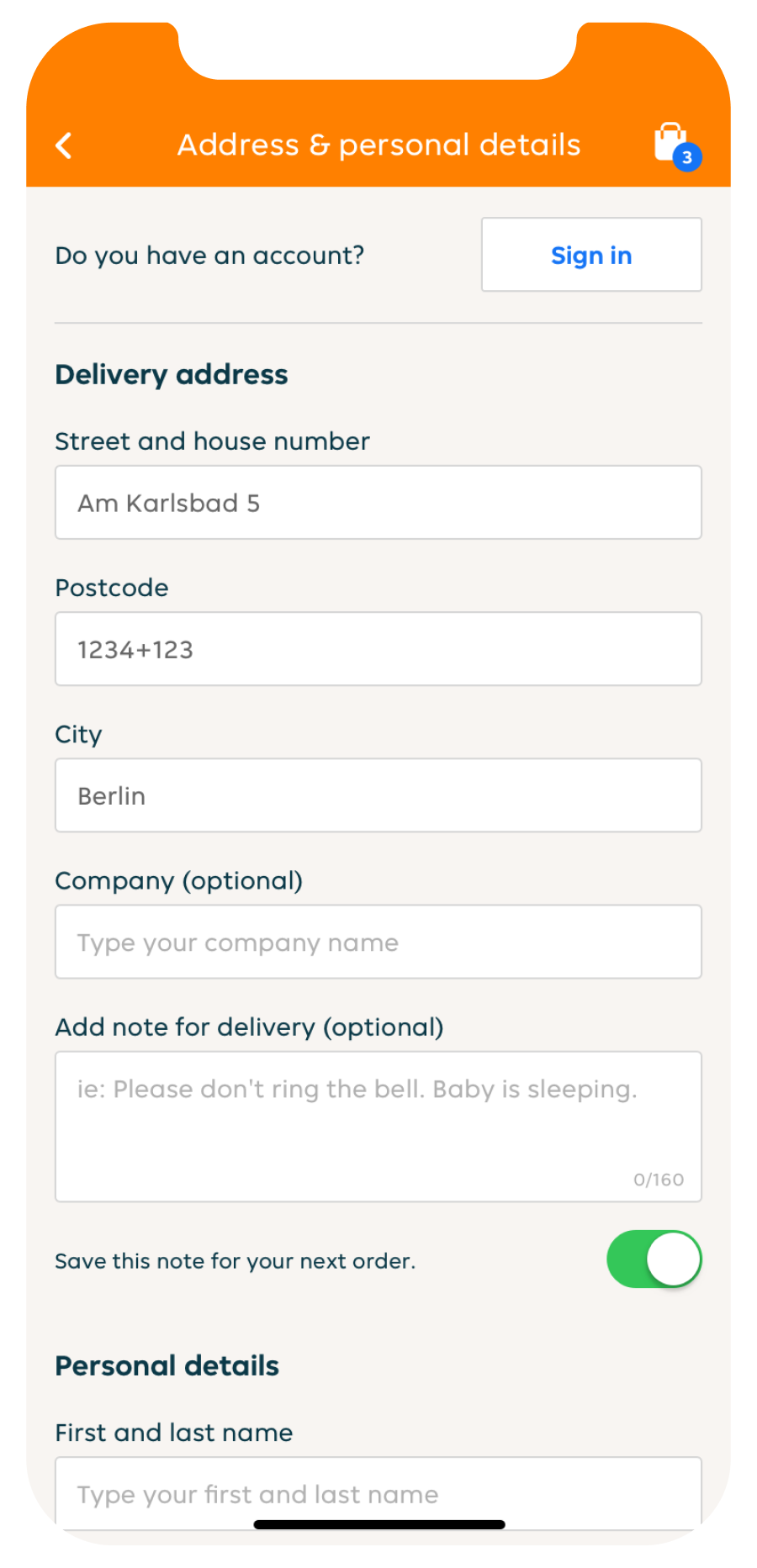
Five out of six participants were unsure about their address or wanted to add additional address information

Aligning all flows with app teams
We constructed the insight and accompied various problem statements with success indicators.
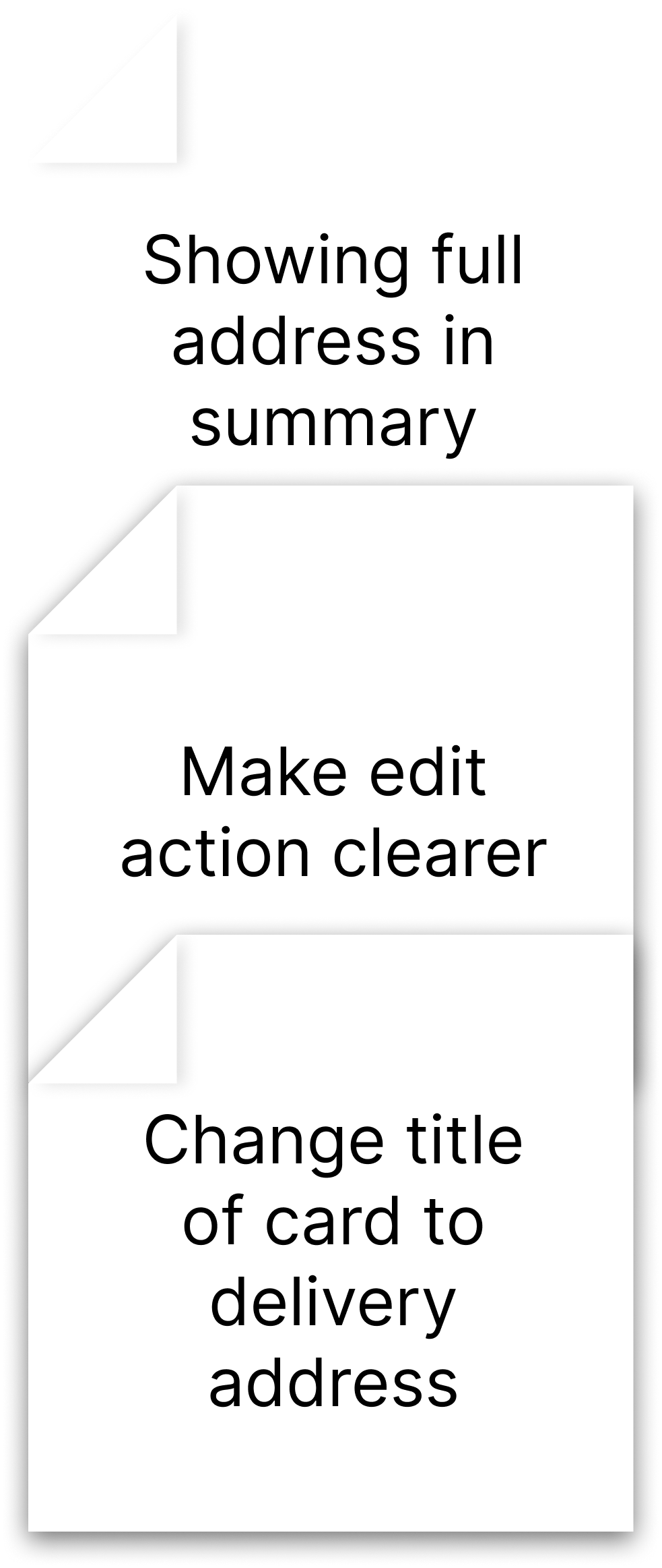
After that the team iterated on solutions and categorized the most efficient solution in order to proceed.
Aligning across nationalities.
Our team faced new challenges such as the migration of new countries within the development and design of the cehckout which ensured a lot of additional features and validations from users.

Quantitative testing
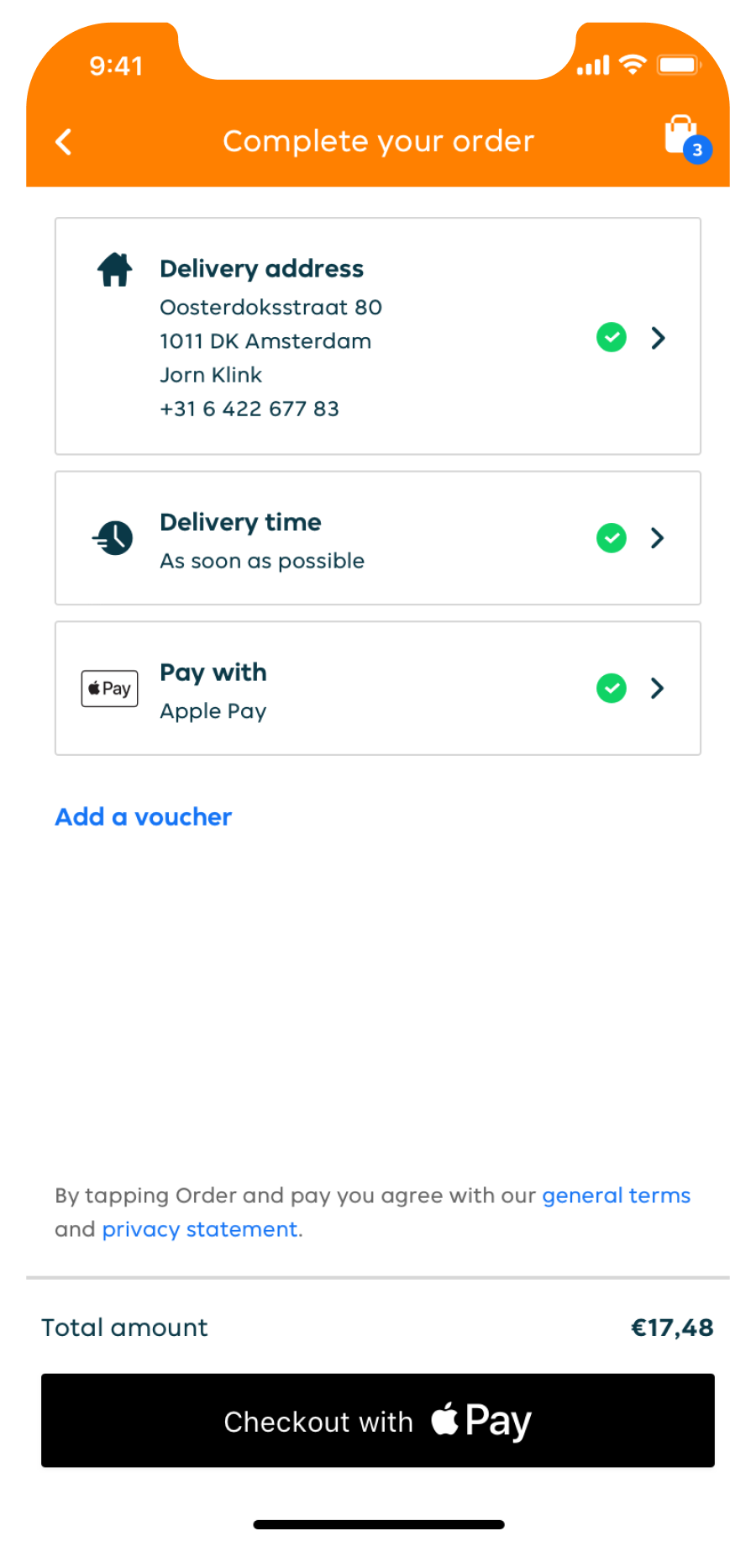
The design on the right has been used as a variation and tested accross various markets for several periods to see a positive significance against the current checkout.
During these test we found out that we reached a significant decrease of steps towards the address page while maintaining conversion.
This insight opened up a new initiative which will further investigate the trust of address information within the app.