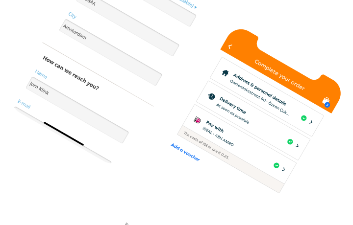
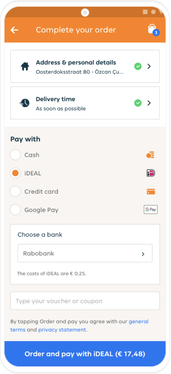
In the early beginning of 2020 we have managed to launch a complete new checkout for Just Eat Takeaway.com which had a simple philosophy; Letting the user order food as easy as possible.

The process of reimagining the checkout of Takeaway has been a continuing challenge to validate the increase of usability while still satisfy the expectations from the product team.
Analyzing current checkout
The process of reimagining the checkout of Takeaway has been a continuing challenge to validate the increase of usability while still satisfy the expectations from the product team.

Aligning all flows with app teams
Meanwhile different trajectories have been created to align the process for Android and iOS to maintain velocity but also tackle features and added flows due to new business impact.
We iterated on many versions and used a inbetween design for our android users to still improve the checkout while knowing that the new checkout design was in sight

Aligning across nationalities.
Our team faced new challenges such as the migration of new countries within the development and design of the checkout which ensured a lot of additional features and validations from users.
Collapsing all known data
During the redesign we have kept on validating our designs by doing moderated user tests, keeping a pulse on our main KPI’s while slowly rolling it out in various countries.
Our current checkout is never finished, but has a framework which allows our team to ideate new intiatives which are never ending.