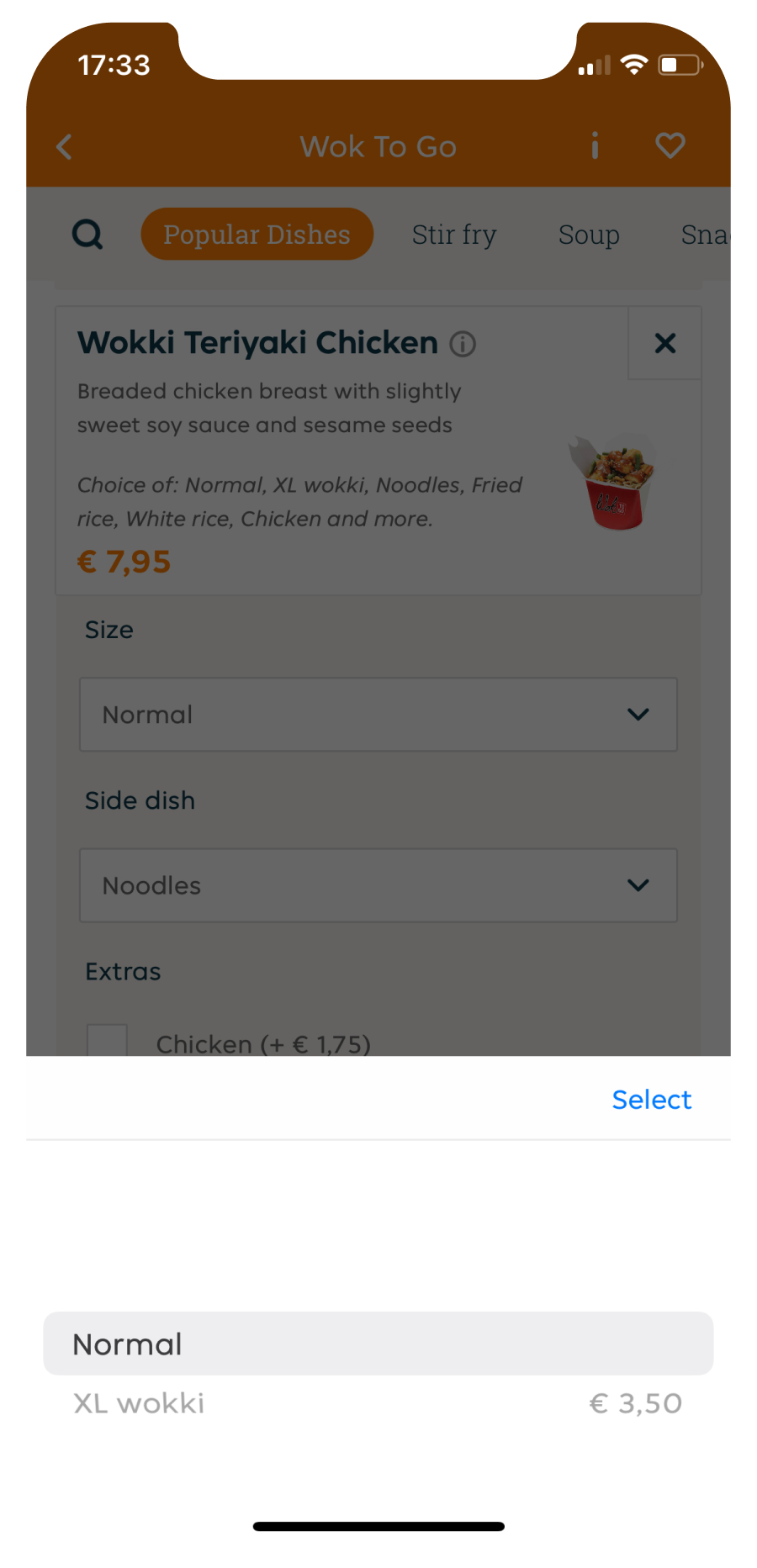
A lot of times user insights are drivers for new features. This time we decided that we wanted to know what the team decided to change.
The current state of showing the side dishes of a menu item has been a pitfall for a lot of us in our team as users and as designers/researchers.
During one of our workshops we spearheaded the side dishes feature as the next change on our list
Analyzing current additions
Next to our own opinions, we received internal feedback about the way how we are showing the side dishes. We teamed up and created iterations based on several insights and analysis.

Collaborating with the team
Our team was briefed every step of the way and in charge of decisions based on what we wanted to test.
Eventually we decided to test the current state with our new iteration
Validating new feature
We conducted several qualitative user tests and found out our new iteration was a welcoming feature within our platform.
We quickly received more insights to present the findings and adjust the iteration accordingly
Learning & next steps
We learned that our new feature reduces a lot of cognitive load which is a painpoint in other parts of our platform. The feature has been released within internal teams and anticipated by the company.